It’s usually while I’m waiting for feedback from the client, somewhere between the rough cut and the final cut, that I begin to do one of my favorite things: a color pass. It’s an opportunity to re-align colors that may be shifted too far in a particular direction or a chance to add some style to the overall production.
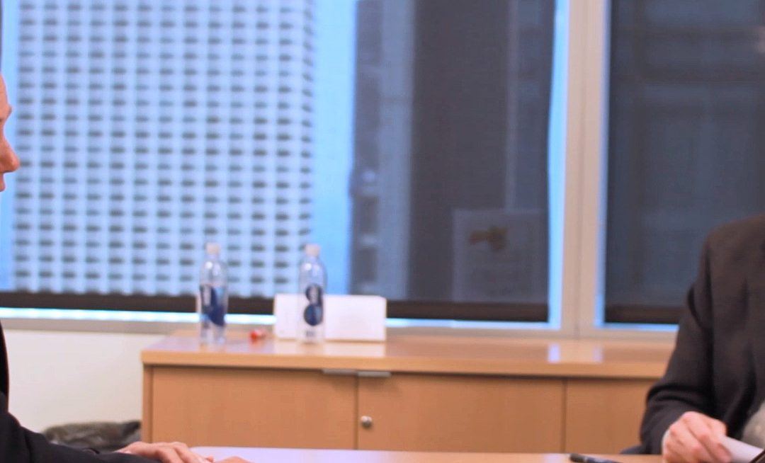
At a minimum a color correction pass is usually performed. Rarely does a photographer snap an image and not make tweaks to it later in post-production, the same is done for video production. A color correction is a pass on the footage to adjust the image to make it a bit more harmonious with all of the other parts. In addition to just wanting the image to look better for the client, there are a myriad of reasons why it might be required. Rather than list many of the examples, let’s take a look at an image taken from a recent shoot.
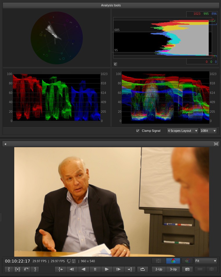
The image is slightly under exposed, & is definitely too warm. While this may be a suitable look for a romantic embrace, it’s perhaps a bit much for the boardroom. The job now is to bring the overall tone of the footage back in alignment with what we’re looking for. We wanted something more neutral and a bit of vignette to direct the attention of the viewer. Here’s what we have after our color correction pass.
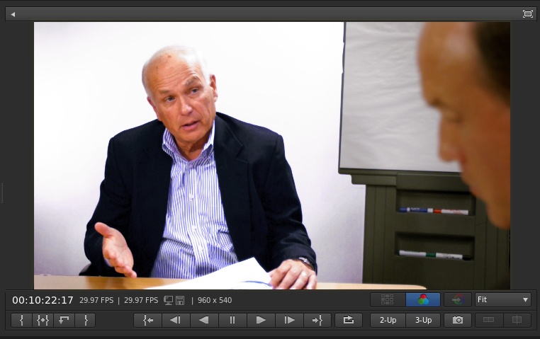
We’ve restored the white walls of our boardroom and gotten the skin tones looking more natural. Overall, a much cleaner image and more appropriate for the client’s production.
Generally, color correction is one of those elements that goes almost completely unnoticed when done correctly, but stands out when it’s missing or poorly implemented. It’s a powerful tool used to polish the final deliverable, one the client doesn’t always notice but should come to expect.